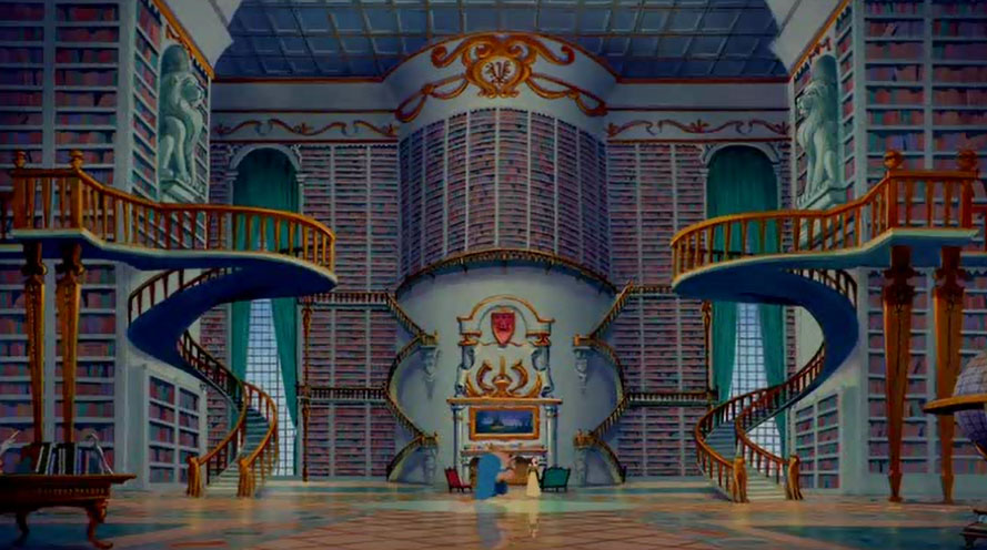
Cogsworth: As you can see, the pseudo-façade was stripped away to reveal the minimalist Rococo design. Note the unusual inverted vaulted ceilings.
[as he, Lumiere, and Belle walk past the knights in armor, they turn their heads to follow them]
Cogsworth: This is yet another example of the late neoclassic Baroque period. And, as I always say, “If it’s not Baroque, don’t fix it!”
[notices the knights with their heads turned]
Cogsworth: As you were!
[the knights turn their heads back forward]-The Beauty and the Beast (1991)
I developed my interest in architecture eversince I was still a kid by watching cartoons and by tagging along my mom whenever she has to go somewhere related to her work. It was my idea of fun. While my mom was on business, I would go around the area checking on the structure and I find myself enjoying the view up to the littlest detail. Little did I know, I get to have a few friends from the place also! From there on, I got to establish my curiosity in architecture and interior design.
When I do my design work, I can honestly say that I am into modern minimalist concepts. I admire its simplicity and functionality. However, I also on the other hand, appreciate classical design. As people say, I am an old soul. When it comes to the classics, I really am into baroque style.
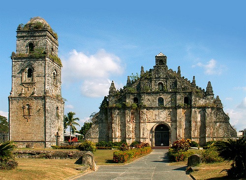
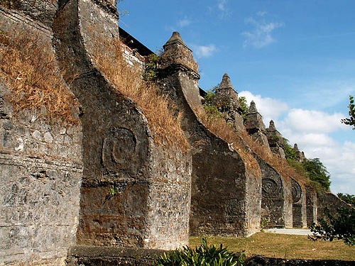
Baroque style evolved in Rome during the 16th Century falling under one of the renaissance phases. Characteristic of the Baroque architecture includes the following: Chiaroscuro (use of light and shade to produce dramatic effect), High frescoed ceiling, use of trompe l’oeil and the blending of painting and architecture, Fragmentary or deliberately incomplete architectural elements, external façade often characterized by a dramatic central projection, etc.
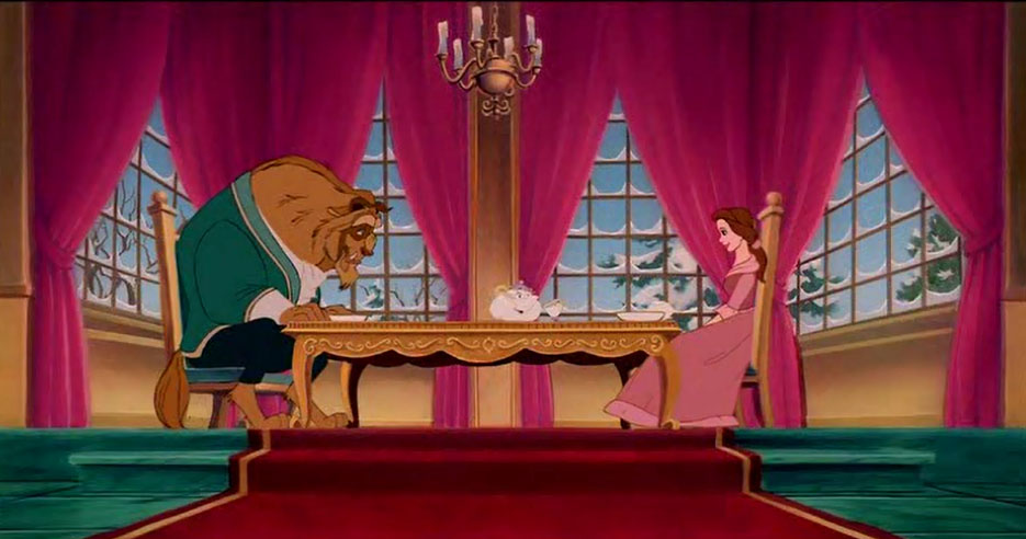
I was first introduced to this type of design from the movie “Beauty and the Beast”, and I had no idea then that it was called as such.
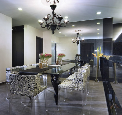
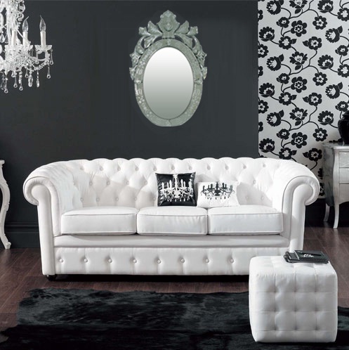
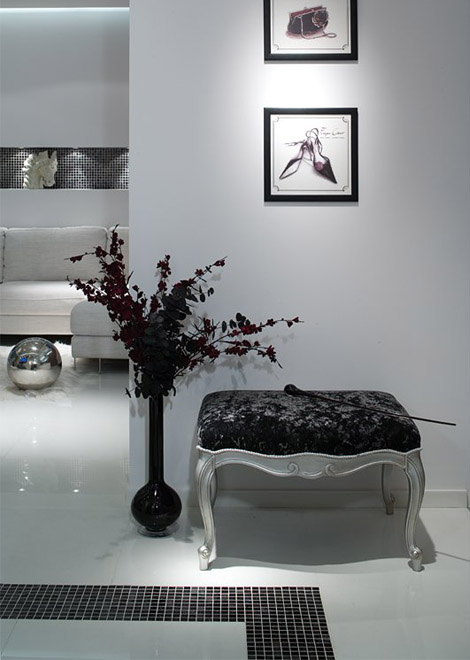
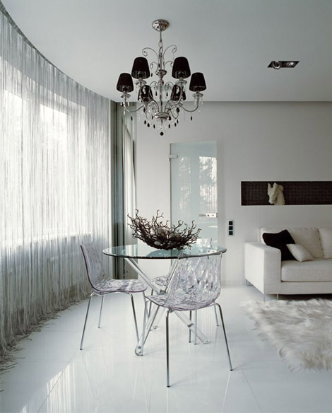
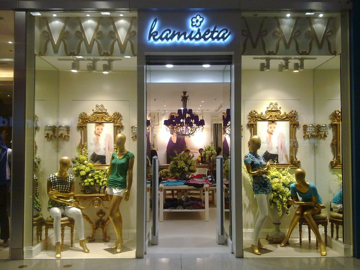
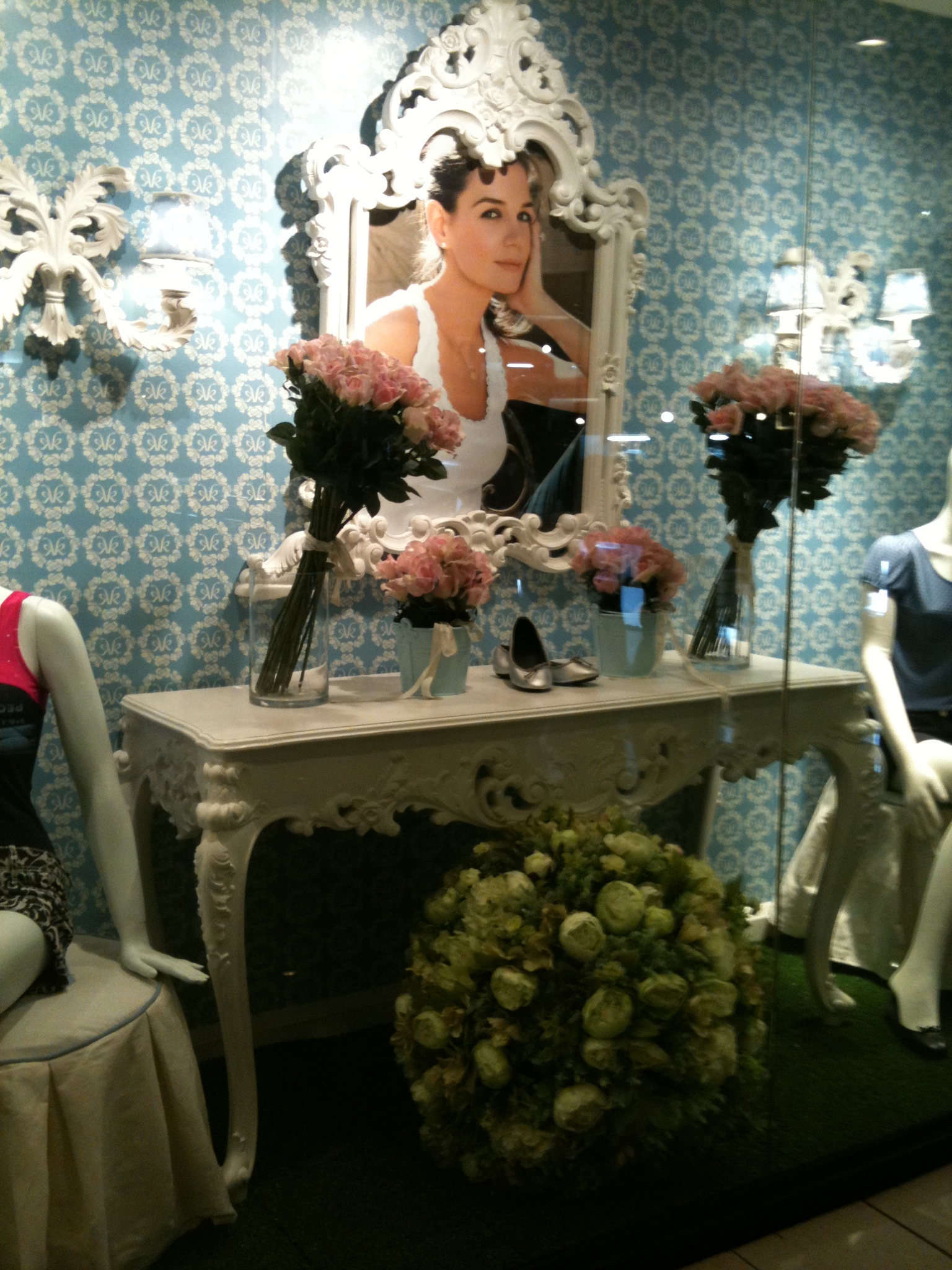
Now let’s see what it looks like when it’s mixed up with a modern touch.
